You don't understand what the animation is about? Below you will find a brief description but you can also visit the following sites that offer a wealth of higher quality data. You can start with this introduction about Ice Shelves from the National Snow and Ice Data Center. NASA has a very interesting piece about the Wilkins Ice Shelf and ESA has another one. If you prefer videos, this one is nice. And some news... from the Newscientist and Reuters
What is an Ice Shelf? It's a thick, floating platform of ice that forms where a glacier or ice sheet flows down to a coastline and onto the ocean surface
Are there many Ice Shelves? There are quite a lot. You can find them in Antarctica, and along the Greenland and Ellesmere Island coasts. They have very different sizes, some of them are quite small and some, like the Ross Ice Shelf, are bigger than Japan.
What is the Wilkins Ice Shelf? It's an ice shelf located in the Antarctic peninsula which has an extension over 10000 square kilometers.
Why are you interested in the Wilkins Ice Shelf? This ice shelf is now only held up by a very thin strip of ice (varying from 2 km to 500 meters at the narrowest), which makes it very vulnerable to cracks and fissures. If the strip were to break, it would break from the Antarctic Peninsula releasing it to the sea.
When will it happen? Nobody knows. It's right now hanging by its last thread so it could be in weeks or months. Right now (February) we are at the end of the Antarctic summer so it seems like a good moment to break. Last year a big piece of the Wilkins Ice Shelf broke the last days of February. The evolution this year is quite similar to that observed the last year, so make your guess.
Who is taking these pictures? Due to the ice shelf imminent risk of collapse ESAs Envisat satellite is observing the area on a daily basis. Additionally NASA's Terra and Aqua satellites overfly the area several times a day. What you can see here are the images taken either by Envisat, Terra or Aqua.
How are the pics taken? It depends on the satellite. Terra and Aqua use the MODIS sensor It's an optical sensor (basically a highly sophisticated photographic camera) capable of acquiring images with a resolution up to 250 meters. Envisat uses the Advanced Synthetic Aperture Radar (ASAR) (basically a highly sophisticated radar similar to those used in the airports) capable of acquiring images with a resolution up to 30 meters.
Wha are the differences between radar and optical images? I don't know how to answer this question in a paragraph. Just some notes, optical sensors are basically photographic cameras and so they cannot take images during the night or through the clouds. On the other hand the images they take are similar to what you would see if you were there and that makes them much easier to understand.
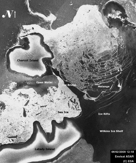
Radar instruments are able to "see" trough the clouds and during the night, but what you are receiving are the reflexion of the radar waves. Some times the way these waves are reflected have little to do with the way "normal" light is reflected and it can be quite hard to understand what the image means. As an example you will see that in the radar images the Ice Shelf will appear as black but the sea ice will appear mostly white (by the way radar images have no colour so they are black and white)
Radar instruments are able to "see" trough the clouds and during the night, but what you are receiving are the reflexion of the radar waves. Some times the way these waves are reflected have little to do with the way "normal" light is reflected and it can be quite hard to understand what the image means. As an example you will see that in the radar images the Ice Shelf will appear as black but the sea ice will appear mostly white (by the way radar images have no colour so they are black and white)
How often are they acquiring images? ESA's Envisat takes one image daily, although some days it will take two and some days none. NASA's Terra and Aqua take around six-eight images daily each one. But as Terra and Aqua use an optical sensor night and cloudy images are of no use. Usually you will get some good images every four-five days.
 False Color Image of the Wilkins Ice Shelf as seen from MODIS at 100m resolution.
See Note
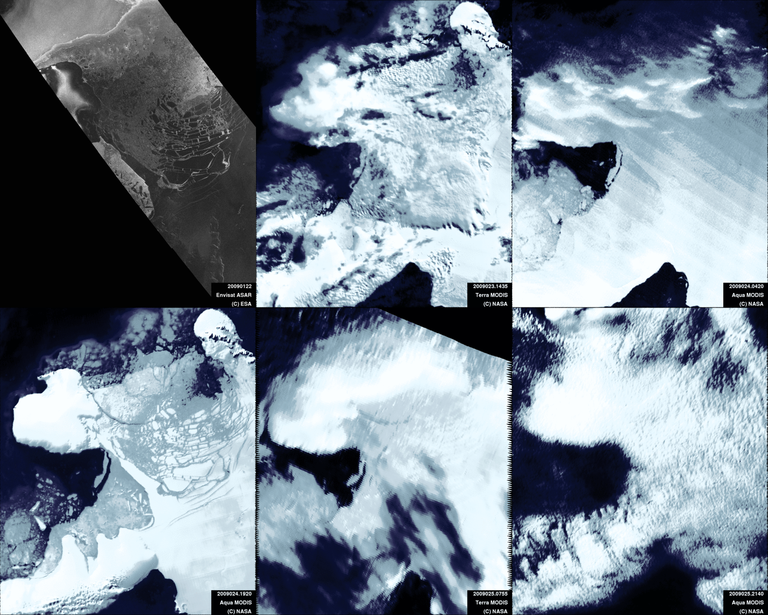
Why do you have so many different images? Black and white images are Envisat ASAR images, as they are radar images they have no color. Blue/Cyan/eerie color images are images taken with Terra and Aqua MODIS. Originally they were black and white but I have given them false colour to distiguish them from ASAR images. These images have a spatial resolution of 100 meters.
The colour images are taken also using MODIS but have a spatial resolution of 250 meters. In this case I use more information from the sensor and a processing software developed by Liam Gumley from the University of Wisconsin-Madison and Jacques Descloitres and Jeffrey Schmaltz from the MODIS Rapid Response Team, NASA Goddard Space Flight Center You can find more information here
The colour images are taken also using MODIS but have a spatial resolution of 250 meters. In this case I use more information from the sensor and a processing software developed by Liam Gumley from the University of Wisconsin-Madison and Jacques Descloitres and Jeffrey Schmaltz from the MODIS Rapid Response Team, NASA Goddard Space Flight Center You can find more information here
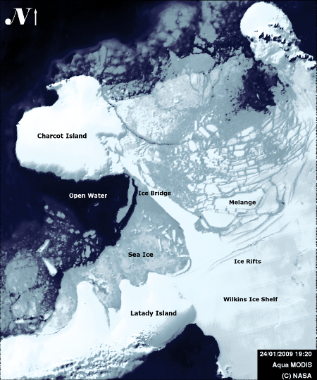
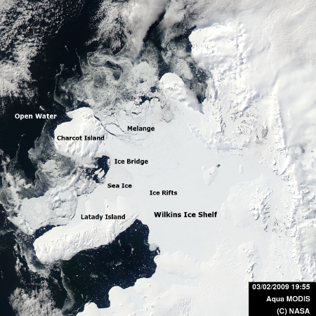
What can we see in the images? For Terra and Aqua usually clouds except for the few days that are clear. These days (and for Envisat) you usually can see two islands, Lakadi and Charcot, a small piece of the Antarctic Peninsula and the Wilkins Ice Shelf that links the two islands with the mainland.
The most interesting part is the ice bridge that links the Wilkins Ice Shelf with the Charcot Island. Right now the ice shelf is held up by this very thin strip of ice, varying from 2 km to 500 meters at the narrowest. If the bridge were to break, it would release the ice shelf. While it breaks you can pay attention to the ice rifts that are forming in the ice shelf (easier to see in the radar images) and the growth and decrease of the sea ice surrounding the ice shelf.
The most interesting part is the ice bridge that links the Wilkins Ice Shelf with the Charcot Island. Right now the ice shelf is held up by this very thin strip of ice, varying from 2 km to 500 meters at the narrowest. If the bridge were to break, it would release the ice shelf. While it breaks you can pay attention to the ice rifts that are forming in the ice shelf (easier to see in the radar images) and the growth and decrease of the sea ice surrounding the ice shelf.
Why are the blue images blurred? It has to do with their spatial resolution. MODIS images have a resolution of 250 meters and ASAR ones have a resolution of 100 meters. As I wanted to put them together and I didn't want to lose information I resampled MODIS to 100 meters. Of course that means that when you look to them closely they look blurred as any pic will look if you zoom too much. It's not a problem of the sensor but a result of the way I process them.
Why are you doing this? i.e Don't you have a life? Well, this started as a project for the European Space Agency to monitor the Wilkins Ice Shelf using Envisat. After finishing the project I found out that sometimes it was very difficult to analyze the images and started to look also MODIS and MERIS images. As I had just done it for Envisat it seemed natural to do the same for Terra and Aqua, specially because I was missing the times when I was working with MODIS data. The idea was to do something very simple (even more than this!) but as I started to dig into the algorithms I found them easier than expected and I was hooked by the thrill of solving the different problems I was finding. The result is what you are seeing right now.
I do have a life (at least by Roman standards) by I also like playing with this stuff and see the results, so... you could say this was my way of having fun this winter :-)
I do have a life (at least by Roman standards) by I also like playing with this stuff and see the results, so... you could say this was my way of having fun this winter :-)
To finish an animation of a nice day in the Wilkins Ice Shelf in 2008. You can see the animation placed on the Earth globe. But you will need to have Google Earth installed.
Thanx are due to both ESA and NASA that made this possible.... (change that into whatever law stuff it applicable)


